My role:
Results:
29%
Checkout completion rate
20%
Lower cart drop offs
10%
Increase in checkout speed
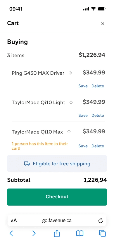
The Solution: A cart that is always accessible during the shopping journey
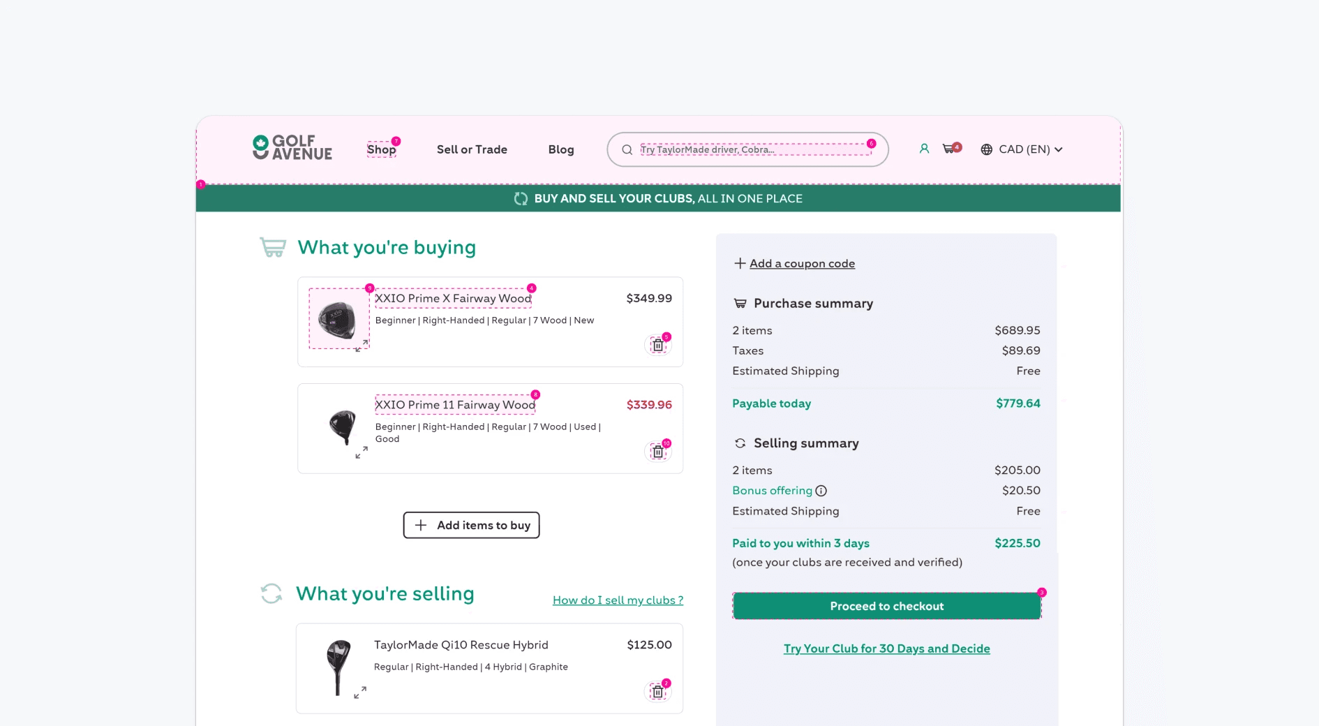
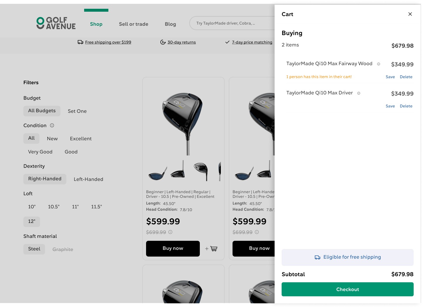
We introduced a side cart that could be opened at any time—giving users the opportunity to check and adjust the contents of their cart without leaving the shopping journey. So they could move to checkout only when their decision was made.
Design decisons
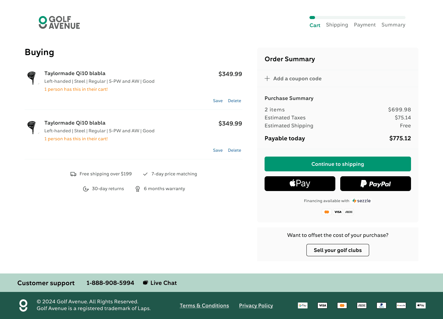
Moving express checkout options a click away from side cart
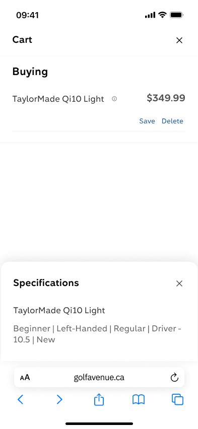
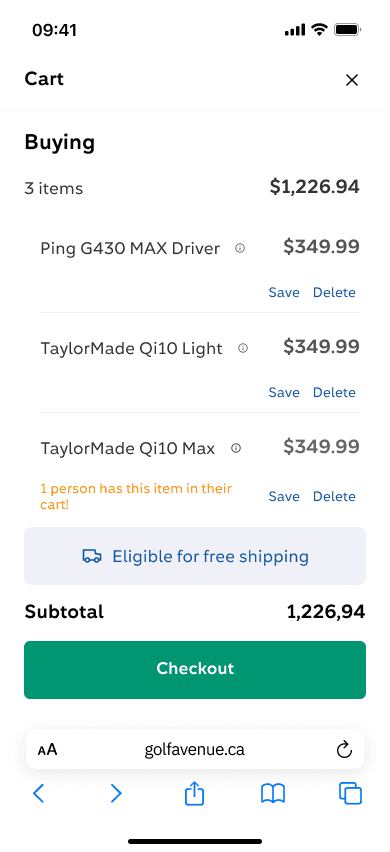
The side cart was meant to let users know what they have in their cart, compare items and save or delete if desired. Therefore we kept the design minimal and removed secondary information and options.
We had some discussions with stakeholders around showing express checkout methods like Apple pay on the side cart.
After analyzing pros and cons we chose to leave out express payment options to keep the side cart focused on decision-making. Including them would have required adding coupon code fields as well—too much for a clean mobile experience, and having these options presented at checkout was the trade-off we decided to go with.
Keep specs or hide
Decided to show specs on hover instead of showing them at all times. reducing noise but allowing users to easily view them to make a decision.