Increased checkout completion by 29%
Increased checkout completion by 29%
Enabled users to view and edit their cart content with a side cart

Increased checkout completion by 29%
Enabled users to view and edit their cart content with a side cart

Scope:
This project is the revamp of the checkout experience of Golf Avenue's ecommerce website.
My role:
I contributed to competitive analysis, ideation, and design exploration alongside a senior designer, and was responsible for prototyping, user testing, leading engineering feasibility discussions, and redesigning the cart UI.
Results:
29%
Checkout completion rate
20%
Lower cart drop offs
10%
Increase in checkout speed
Industry
E-commerce
Team
Senior designer, PM, Devs
Platforms
Web and mobile
Timeline
4 months
Industry
E-commerce
Team
Senior designer, PM, Devs
Platforms
Web and mobile
Timeline
4 months
Scoep:
My role:
This project is a revamp of the cart/checkout experience for a retail ecommerce website that included 3 flows of buying, selling and trading. Below you can find parts of the buying experience.
I contributed to competitive analysis, ideation, and design exploration alongside a senior designer, and was responsible for prototyping, user testing, leading engineering feasibility discussions, and redesigning the Cart UI.
Results:
29%
Checkout completion rate
20%
Lower cart drop offs
10%
Increase in checkout speed
Industry
E-commerce
Team
Senior designer, PM, Devs
Platforms
Web and mobile
Timeline
4 months
PROBLEM AREA
Users were dropping off because of long load times between cart and shopping pages
Shoppers were adding all their “maybe” options to the cart, then navigating back and forth between the cart and product pages to compare, delete, and rethink. While doing that they saw long load times and some eventually dropped off.
As a consequence the company was loosing on average $1M sales yearly. The goal was to increase checkout completion.
TECHNICAL LIMITATION
Long load times couldn't be easily reduced
The checkout was built on a different platform than the rest of the website. Because of this, moving between the site and the checkout was sometimes slow, and it wasn’t something we could easily fix.
Long load times when users left entered or left the checkout

Strategy
Giving users a side cart so they can easily review cart contents while browsing and avoid going back and forth between checkout and browsing.
SOLUTION
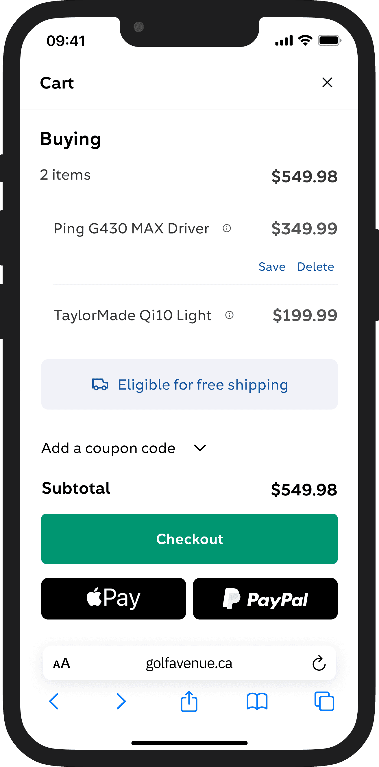
The side-cart : Giving quick access to the cart
Through brainstorming with stakeholders and looking at competitors, we introduced a side cart that could be opened at any time, giving users the opportunity to check and adjust the contents of their cart without leaving the shopping journey. So they could move to checkout only when their decision was made.
The shopping flow - From add to cart to checkout
The shopping flow - From add to cart to checkout

Side cart - Desktop and mobile
Side cart - Desktop and mobile
Side cart - Desktop and mobile
Add to cart notification on mobile
Add to cart notification on mobile
Add to cart notification on mobile
Cart icon to side cart interaction on mobile
Cart icon to side cart interaction on mobile
Cart icon to side cart interaction on mobile
Add to cart notification on mobile
Cart icon to side cart interaction on mobile
DESIGN DECISIONS AND TRADEOFFS
Excluded Express Checkouts CTAs from the side cart
After analyzing edge cases on mobile, I chose to leave out express payment options to keep the side cart focused on decision-making. Including them would have required adding coupon code fields as well. That was too much for a clean mobile experience. Having these options only presented at checkout was the trade-off I decided to go with.
Option 1
Express checkout available on the side cart
Not enough space for more than 2 products
Cluttered interface
Option 2
Express checkout not available on the side cart
More space for products - easier decision making
Less cluttered- easier decision making
One more click and page load before user can use express checkout
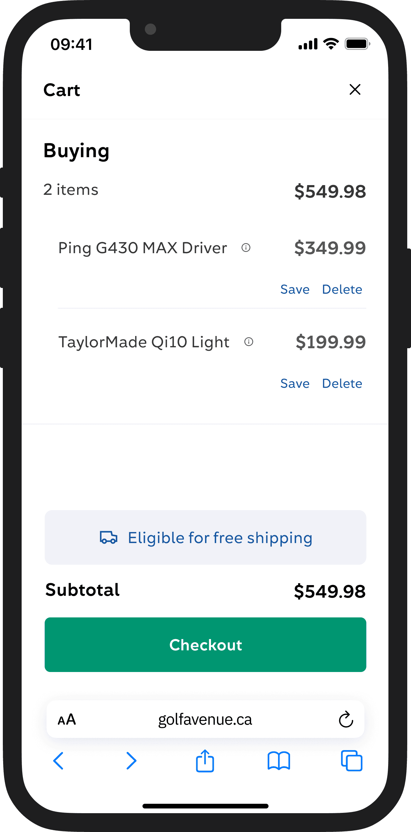
Placed specs behind a tooltip
Based on user insight and data I knew users usually know the specs they need and it's unlikely for users to add the same product twice to cart with different specs. so specs are secondary information that can be hidden behind a tooltip. Also user testing showed users were easily able to find product specs by pressing on the tooltip.
Option 1

Specs available when clicking on the tooltips
Less cluttered
Focus on product title and decision making
Option 2

Specs available at all times
Cluttered interface
Too many focus points, not easy to make a decision
Placed specs behind a tooltip
Based on user insight and data I knew users usually know the specs they need and it's unlikely for users to add the same product twice to cart with different specs. so specs are secondary information that can be hidden behind a tooltip. Also user testing showed users were easily able to find product specs by pressing on the tooltip.
Specs available when clicking on the tooltips
Less cluttered
Focus on product title and decision making
Specs available when clicking on the tooltips
Less cluttered
Focus on product title and decision making
Option 1
Specs available at all times
Cluttered interface
Too many focus points, not easy to make a decision
Option 2
Express checkout available on the side cart
Not enough space for more than 2 products
Cluttered interface
Option 1
Express checkout not available on the side cart
More space for products - easier decision making
One more click and page load before user can use express checkout
Option 2
IMPACT
Fewer drop offs, More sales
The streamlined side cart experience (designed for speed and clarity) made it easier for users to review their selections and proceed with confidence.
Cart drop-offs decreased, and while fewer users started checkout, a higher percentage completed it.
I lead the designs for a revamp of the cart/checkout experience that included 3 flows of buying, selling and trading. Below you can find some designs from the buying experience.
Results:
29%
Checkout completion rate
20%
Lower cart drop offs
10%
Increase in checkout speed
View next project
Redesign
E-commerce
Responsive web
14% higher conversion with design
Optimized the Trade-in flow while navigating risk and technical constraints.
Read case study

14% higher conversion with design
Optimized the Trade-in flow while navigating risk and technical constraints.
Redesign
E-commerce
Responsive web
14% higher conversion rate with design
Optimized the Trade-in flow while navigating risk and technical constraints.
Redesign
E-commerce
Lead designer
Opportunity: How might we reduce cart drop offs
Users were dropping off because of long load times between cart and shopping pages
Users dropping off because of long load times between cart and shopping pages
Observing user behavior showed us a common pattern:
Shoppers adding all their “maybe” options to the cart, then navigating back and forth between the cart and product pages to compare, delete, and rethink.
This back and forth created friction for users and led to high drop offs from the flow.
So we asked: how might we support decision-making earlier, without disrupting the shopping flow?
Shoppers were adding all their “maybe” options to the cart, then navigating back and forth between the cart and product pages to compare, delete, and rethink. While doing that they saw long load times and some eventually dropped off.
As a consequence the company was loosing on average $1M sales yearly. The goal was to increase checkout completion.
PROBLEM AREA
Heatmap of the old cart showing a high number of users going back to the shopping journey


Heatmap of the old cart showing a high number of users going back to the shopping journey
User observation: Users were using the cart as a decision making step and going back and forth
Observing user behavior showed us a common pattern:
Shoppers adding all their “maybe” options to the cart, then navigating back and forth between the cart and product pages to compare, delete, and rethink.
Technical limitation: Long load times couldn't be easily reduced
This back and forth created friction for users and led to high drop offs from the flow.
This could not be easily fixed because the checkout was part of a different platform integration.
TECHNICAL LIMITATION

Long load times when users leave the cart to go back to the shopping journey.
User friction: Long load times between cart and shopping
This back and forth created friction for users and led to high drop offs from the flow.
TECHNICAL LIMITATION
Long load times when users leave the cart to go back to the shopping journey.
Long load times couldn't be easily reduced
The checkout was built on a different platform than the rest of the website. Because of this, moving between the site and the checkout was sometimes slow, and it wasn’t something we could easily fix.
TECHNICAL LIMITATION